
Looking around, a few things are apparent:
- Everyone is still using Excel.
- Spreadsheets still contain errors.
- Graduates still don't have the requisite spreadsheet skills upon entering the workforce.
- Companies still aren't regularly enforcing good model governance.
This article (see page 7) looks at how we can address the issues and make spreadsheets more user-friendly and faster to use, less prone to error and more capable of completing the tasks required of them.
Full article: Excel and modeling governance: What can we do better?
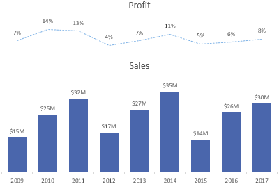
Sometimes a secondary axis is a necessary evil. After all, most of the time you can't plot big numbers and little numbers in the same chart without the little numbers getting lost in the scale.
With a few simple changes, we're able to present our readers with a chart that's quick and easy to read. Let's be honest, anything less would be a waste of their time and yours.
Full article: Excel chart secondary axis alternatives
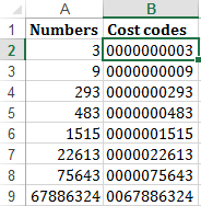
When is the last time you used the REPT function in Excel? REPT is one of Excel's little-known, overlooked and underutilized functions, yet it is very useful.
Here are 7 ways you can start using the REPT function:
- Add leading zeros.
- Create inline charts.
- Replace nested
IF. - Create a mirror chart.
- Create stem and leaf plots.
- Extract N words from a text string.
- Create a star rating system.
Full article: 7 ways to use Excel REPT function
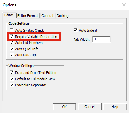
When looking at other people's VBA code in books or on the internet we often see the Dim statement being used to declare variables.
It is possible to write valid VBA code without declaring variables, so why bother?
This blog discusses the advantages and disadvantages of declaring variables in VBA.
Full article: Do you have to use Dim to declare variables?
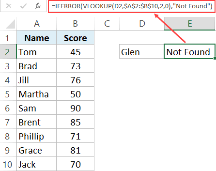
When using the VLOOKUP formula in Excel, sometimes you may end up with the ugly #N/A error. This happens when your formula can not find the lookup value.
In this tutorial, I will show you different ways to use IFERROR with VLOOKUP to handle these #N/A errors cropping up in your worksheet.
Using the combination of IFERROR with VLOOKUP allows you to show something meaningful in place of the #N/A error (or any other error for that matter).
Full article: Use IFERROR with VLOOKUP to get rid of #N/A errors
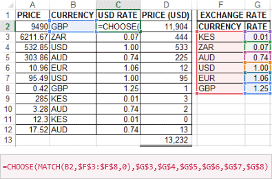
The IF function is one of the most used functions in Excel. In my opinion, it is the foundation of all programming and Excel's formulae mastery.
However, it is also one of the most misused functions, especially nested IF. Especially now with Excel 2007 and beyond, you can nest up to 64 IF functions to form complex, slow and hard-to-understand IF THEN ELSE statement.
You don't need to slow or complicate your worksheet anymore, this article describes 7 alternatives to using nested IF functions.
Full article: How To Replace Nested IF Function: 14 Alternatives
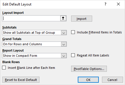
A recent update to Excel allows you to set the default PivotTable layout.
Now, when you're building complex reports or performing one-off analyses, you can quickly get started with your favorite PivotTable layout. This feature is available for Excel 2016 on Windows as part of an Office 365 subscription.
The performance of OLAP PivotTables has also been improved.
Full article: PivotTables just got personal
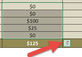
In Excel (2013 or above version), whenever you select some data from a range of cells you get a small icon on the bottom right hand corner - it is called QUICK ANALYSIS.
I want to inspire you to use this tool, and for this I have listed 5+1 amazing things which you can do with the quick analysis option and which will save you a lot of time!
Some of the tasks that you can accomplish with the Quick Analysis tool are:
- Add running total.
- Create a Pivot Table.
- Recommended charts.
- Percentage share.
- Insert a sparkline.
- Highlight greater than values.
Full article: 5 + 1 reasons you should use Excel's Quick Analysis option
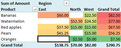
PivotTables in Excel are pretty awesome. In just a few clicks, you can build a detailed report that gives you quick and important insights into your data.
If you polish your PivotTables in the right way, your data and associated reports will be so much more valuable to your friends, colleagues or your manager.
In this post you'll get a wide range of tips to improve your PivotTables, including various shortcuts and hints that may have never heard about:
- Refresh your data source (to ensure your report is correct).
- Disable AutoFit Column Widths.
- Sort your data to answer the real questions.
- How should blank cells be presented?
- Change Subtotal options.
- Group dates together (by Week, Month, Quarter, Year…).
- Show values as a percentage or rank.
- Apply a Style to your PivotTable to align with your branding.
- Support your PivotTable with a PivotChart.
- Analyse relevant data in detail by double-clicking a cell.
- Add Slicers to enable quick filtering.
Full article: Polish your PivotTables with these excellent tips
