22 June 2013
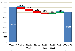
A Waterfall Chart is a great way to present data when looking at the incremental contribution of individual elements in reaching from one milestone to the other.
Let's take an example below. The left most column shows the total sales for last year, the right most shows the total sales for current year and the segments in between show the incremental contribution of each region in current year over last year. The reds show a negative contribution and the greens show a positive one.
Now let's learn how to make this chart.
Full article: Custom charts in Excel: Waterfall chart
