21 July 2018
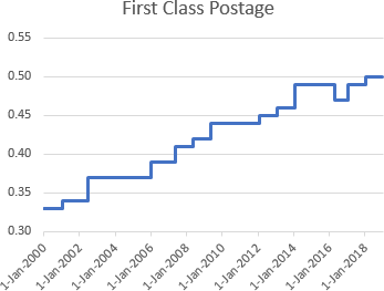
Step Charts are useful for showing values that don't change steadily from one point to the next, but that instead are constant for a period of time, then jump to the next level, and are constant for another period of time.
For example, step charts are good for showing how things like postal rates or interest rates change over time.
Step charts are not native to Excel, but it's not hard to build a step chart, with a bit of data tweaking and some smoke-and-mirrors formatting.
There are two ways to build step charts:
- One geared towards timelines (line charts with X-axis dates) which uses duplicate points.
- The other towards XY Scatter charts which uses horizontal and vertical error bars.
Full article: Step charts in Excel
