19 May 2013
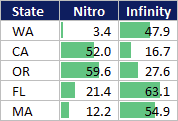
I've emphasized before that the key behind visual design is that every formatting decision you make should have a purpose behind it. In the following post, I plan to demonstrate more of the visual style I use in Excel:
- Dark background and white font.
- Soft gray lines.
- Dotted lines.
- White borders.
- Custom trim.
- Uniform column widths.
- Pastel highlighting.
- Excel data bars instead of color scales.
Full article: Excel visual design tricks
