Authors
Hock Chuan Chan
Abstract
Spreadsheets have been used by organizations for decades. Errors in spreadsheets are commonly found in laboratory and field findings. In recent years, many exciting new visualization techniques have been developed to help users understand spreadsheet models and to check for errors.
Two visualization tools were tested in an experiment for their effects on error correction. The first is a simple arrow tool which shows dependencies among cells. The second shows the input-process-output function of cells in addition to the dependency arrows.
The experiment shows significantly better error detection with the arrow method than for the plain method (without visualization tools). Wrong data errors took more time to correct than missing data errors.
Sample

Spreadsheets essentially comprise an inter-connected web of cells that reference one another through the use of formulas.
There are many different visualization tools in the literature.
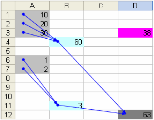
This method aims to label cells for their roles in the model - cells with different roles are given different colors. Links between cells are indicated by arrows.
Publication
2004, Third Annual Workshop on HCI Research in MIS, December, pages 100-104
